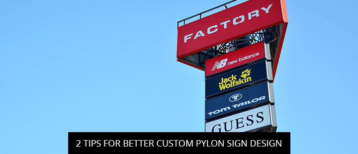
Today’s post reviews marketing and sign comprehension research to bring you two “empirically proven” tips for better custom pylon sign design, courtesy of the Signworld business alliance.
Leverage Research On Effective Color Contrast And Combinations
Color contrast matters in marketing, across all mediums. The greater the contrast between your background and logo/text, the greater your pylon sign’s legibility. This is well established.
For instance, an interesting study by the Journal of Sport Management sought to evaluate the effect that “color contrast between signage and sport surroundings” had on sports viewers’ attention to televised sponsorship signage. At the end of their laboratory study, “it was found that color… significantly impacts sports viewers’ attention” (Bruer & Rumpf, 2015, p. 170). Sponsorship signage with high levels of color contrast generated 63% more impressions.
During the course of their literature review, Bruer & Rumpf (2015) also found several studies rating the performance of different sign colors. These were some of their key findings:
- “Warm” sponsor signage colors (i.e. red) attracted more attention than “cold” colors (i.e. blue)
- Eye-tracking studies found “visual saliency bias” in brand choice based on signs that had brighter colors; in other words, brands with bright signs were more likely to be chosen
- In the field of sensory marketing, color was found to affect the perceived quality of brands
Crucially, we must remember that many of these studies focused on viewer attention at sports games, which attract very different audiences than the average business sign viewer. For instance, it’s not hard to see why passionate sports fans respond better to warm colors. But nevertheless, these findings might help you determine which colors to include in your pylon sign design–or at the very least, reinforce the value of color contrast.
Keep Your Pylon Sign Design Simple
Signworld partners use cutting-edge technology, premium materials, and skills developed through comprehensive training to unlock limitless pylon sign design potential. However, with these customization capabilities at your fingertips, it’s easy to overdo things. But when it comes to pylon sign design, more is not always better–in fact, complicated designs are known under-performers.
For example, research by the Journal of Safety Research highlighted the importance of sign design in their study of traffic sign comprehension. Contrary to expectation, the researchers found that “the driving factors of age group, years of active driving, hours of driving, last time driving, driving frequency, and non-local driving experience had no effect on comprehension performance” (p. 321). Instead, the most important factors were “sign concreteness, simplicity, and meaningfulness.” In other words, even experienced drivers with plenty of training had trouble comprehending over-complicated signs, which resulted in drivers missing important messages.
This is a scary thought in a road safety context, but it teaches us an important lesson about pylon sign design. Overdoing pylon sign design means people will miss your marketing message. Keep your design simple, leaving no doubt for the viewer as to what’s important, and you’ll get much better results.
Free Pylon Sign Quote – Find A Signworld Partner Near You
Need more help with your pylon sign design? Signworld pylon sign experts are located all across America.
Visit the Signworld website or call 888-765-7446 to speak with a representative for help locating a Signworld partner near you.
References
Breuer, C., & Rumpf, C. (2015). The impact of color and animation on sports viewers’ attention to televised sponsorship signage. Journal of Sport Management, 29(2), 170-183.
Ng, A. W., & Chan, A. H. (2008). The effects of driver factors and sign design features on the comprehensibility of traffic signs. Journal of Safety Research, 39(3), 321-328.


