At Sign World, we believe that one of the greatest retail sins is signage neglect. Marketing is the key to monetization, and signs are surefire way to drive foot traffic, conversions, and sales to your business. But if they lack personality, muddle the message, or annoy the reader, they can actually do more harm than good.
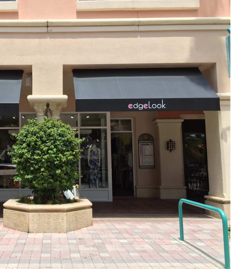
The first rule of thumb has to be with placement. Your sign should be front and center, with its purpose on full display. Your customer should see the sign and know intuitively what it’s selling by how it’s placed. If it’s three aisles down from the product display it pertains to, your signage will do you few favours.
Perhaps even more important than the sign’s placement is the sign’s content. Effective signage must captivate the reader. Think of the sign like the subject line of an email, the cover of a book, or the headline of a newspaper article; nobody’s going to engage the content if their first impression doesn’t grab their attention.
If you want your sign to shine, follow these 5 tips for compelling retail signage:
Be clear and concise.
Twitter’s 140 character used to seem restrictive and overly short, but the Internet Era has shrunk our attention spans more and more every day. Web marketing professionals tell their clients that the average user gives a website 3-4 seconds of attention before bouncing off somewhere else, and you should use this figure to inform your signage strategy. Customers are in a hurry, so distill your message to the bare bones essentials. You’re not going to wow anyone with 5-dollar words and verbose sentences; save that for your Scrabble game and screenplay.
Select a user-friendly font.
Fonts are fun, and various word processors and design programs give us seemingly endless options. But don’t feel pressured to use fancy fonts just because they’re included in your software. Clarity is key: forgo the curly-cues and technicolours and let the reader’s attention fall on what’s important. Some fonts are just plain obnoxious, but anything that slows down the reader’s comprehension is a problem
Give the reader an incentive to buy.
Sometimes it takes more than the promise of a reasonable deal to pique a buyer’s interest. Quite often, you need to explain why they should be buying your product. And you have to do it within a strict word count. Will your product fill their bellies, make them feel great, or give them fabulous hair? Tell your audience as much.
Target the reader with second-person writing.
Using “you” and “yours” can really make the difference for engaging content. When you read text in this tense, you’re encouraged to visualize yourself using the products being described. If your product will give the client incredible hair, tell them “Your hair will never look so good!”
Test your signage strategy.
Sometimes, even the best laid plans fall apart when it’s time to execute. With this in mind, don’t wait until opening day to check whether your planned signage spot is going to work. You may feel your sign is perfect, then realize that it’s too faint to be seen through your store’s tinted frontage. Maybe the font is too small for passing motorists to read. Put yourself in the customer’s shoes and test out the visibility of your sign. If you have to scan or squint for it on your way by, it’s time to rethink your approach.
We hope you’ve enjoyed these 5 signage tips. You can learn more from the experts at https://signworld.org/.