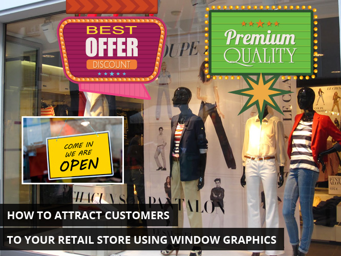
When trying to compete with corporate brand names that are internationally known on the retail front, it’s difficult trying to find your niche amongst the competition. Learning simple ways to attract customers to your location can make all the difference between sink or swim. Window graphics are an excellent way to make that happen by attracting attention to your business at eye level from anyone walking by.
It goes without saying that the effectiveness of window graphics is sometimes lost when there’s a severe lack of foot traffic. Ultimately, the first step towards window graphics success is in finding the right location to situate your business. Consider the time of day, the week, and the year where customers are more likely to walk by where you are situated. This knowledge will come in handy when learning how to target your window graphics towards the audience you have available to your business.
This is your invitation
Window graphics are the equivalent of a welcome rug at eye level. At their best, this is what they are – a message that welcomes one and all to peruse your retail location. Make it an invitation to invite people in. You want to appeal to people’s sense of impulse and try to capitalize on that in the form of a sale. If you can provide them with something that can entertain them, make them laugh, or make them curious, it may be enough to make them stop in their tracks and come in for a look.
Know your approach
Tie in a theme to your window display and make it consistent with the business that you’re promoting. Some people choose to go a comic route. Making them laugh is an easy way to get momentary attention. Something that’s heartfelt or genuine may also serve to attract a certain segment of the population as well. Some businesses just want to entertain and choose to use a mix of bright colours to catch the eye. What this breaks down to is knowing what approach you want to take depending on the type of small business you own and following through with that theme.
Be aware of your environment
Certain small business owners have been known to call this position. Be aware of not only what’s around the window graphics outside but also what’s in the store closest to the entry point. Every element at play – try to angle these towards the window display. Emphasize it. Even if it’s just using shapes and colours, using what you have available to naturally draw the eye towards your window display can mean a very natural focus towards it.
Don’t hesitate to make a big (but tasteful) production
There are many benefits to getting window graphics. They’re not expensive meaning that it’s easy to get a sizeable amount of them. They can be changed frequently or can be kept up for an extended period of time as there’s no permit required to put one up. There’s a lot of freedom to what you can do. Take advantage of it. Be creative.
Be clear in the message but easy to interpret from a distance
Know that no one will be close enough to read any fine print. Ensure that the message from your window graphics can be clearly interpreted from far away and that all print is large enough to read from that vantage point. Less is more. Clouding it up with a large amount of detail isn’t going to serve it well. Anything beyond simplicity is a mistake. If you can create a graphic that is animate enough to attract a person over to it to examine it more closely than you’ve got them.
Window graphics are an art form but there’s no need to overthink it. The most important part to your marketing is to have fun with it. Just be creative and the audience that walks by will be able to see that. If they can pick up on that fun then that’s enough for a person to notice.


