Signworld partners can wrap just about any vehicle–cars, trucks, boats, trailers, helicopters and even low-speed planes–and we can create almost any custom design.
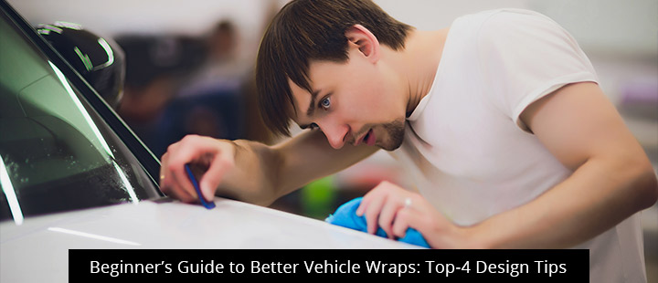
That much choice can be overwhelming, but today’s post is here to help. Read on to learn 4 smart design tips to help you create a high-performance vinyl wrap advertisement for your business.
Make the right color considerations
Color is an important design element that can help or hinder your mobile advertising efforts.
If you haven’t chosen brand colors, now’s the time. Choose carefully because this color will appear everywhere: your business card, website, signage, and vinyl car wrap. Professional graphic designers know how to leverage the evocative power of color to stir certain emotions or associations in the minds of onlookers. For example, red is associated with passion, energy, and aggression, whereas green triggers thoughts of nature, jealousy, and health. Contact a Signworld partner near you for more help choosing a color that evokes emotions related to your brand message.
Whatever you choose, it’s generally best to go bright. Bright colors help your mobile advertisement stand out and reach more people, even from a long distance, at night or in bad weather.
Also be sure to choose strong contrast between the font and background. Though bright colors are generally recommended, they won’t work on certain bright backgrounds.
Be bold.
Vinyl vehicle wraps need to be seen on-the-go and from long distances, so give your readers all the help you can by writing a big message in bold lettering–the bigger and bolder, the better.
Though there’s no absolute formula when it comes to letter sizing and boldness, we can offer some general guidelines. ADAAG Guidelines state that 3-inch letters will be seen up to 25 feet away and 6-inch letters are visible up to 35 feet. But what happens when those letters are on the side of a vehicle moving 50MPH? The United States Sign Council uses the following formula: VRT (viewer reaction time) + MPH/800 = recommended square footage.
Your images should be big and bold, too. Contact a Signworld partner near you for more help with design element sizing.
Keep it simple.
Practice a little restraint when designing your vehicle wrap. Overcrowding the design with multiple graphic elements, fonts, and word bubbles might sound like an easy way to catch the eye, but it only disorients the reader. Unless you’re parked or stuck in traffic, most readers will only get a glimpse of your vehicle as it passes. As such, it’s important that you design your message and visuals for quick consumption. If you can’t take in the main points at a glance, it’s time to summon your internal editor–as Faulkner says, “you have to kill your darlings.”
Of course, this advice isn’t absolute. If your vehicle is going to be parked outside your business or displayed in a showroom, you can get away with a lot more. But even then, remember that most of the best designs are clean and tasteful, rather than crowded and indulgent.
Remember the medium.
In this case, the medium is a vehicle, which will be viewed from every angle. As such, your design needs to be appealing and impactful from every direction. You’ll also need to consider the shape of your vehicle–curves, contours, paneling–and how rolling down a window or opening a door will affect the look of your design.
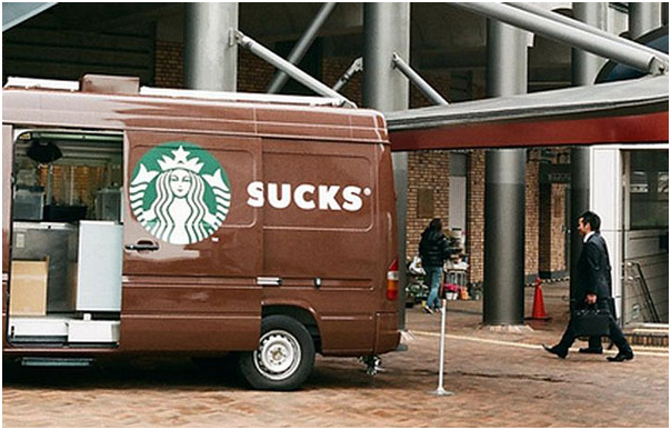
Case in point: Starbucks famously failed to consider the medium–in this case, a side door van–and the end result “sucked.”
Get more pro tips on vinyl vehicle wrap
VIsit our website at https://signworld.org to find a Signworld partner near you.