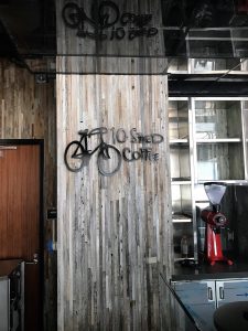
 If you own a business like a coffee shop where many people are coming for the atmosphere, it is very important to have a welcoming interior. From a place to get coffee early in the morning to start your day, to a quiet place where you can energize and get some work done, coffee shops can have different purposes for different people. 10 Speed Coffee did a great job with their interior decor. They are an existing customer of ours that we did some signs for a few years back for their Calabasas location. This year, they opened their Santa Monica location and they reached out to us for an interior logo sign. We had already done the storefront late last year, but the interior was not finished at the time.
The client wanted a specific look to match the existing sign they had at the Calabasas location so they asked for the logo to be made from metal and painted black. They also wanted the sign to be mounted with spacers to float off of the wall. Although metal and acrylic look pretty similar once they’re painted, there are a couple reasons for using aluminum over acrylic for a painted sign. The first reason is if you want that distinct metal texture. If you look at the close-up photos, you can see the texture underneath the paint. If you’re doing an exterior sign, some clients may as for metal for durability. Another reason for using aluminum over acrylic is if you want to mount the sign with studs while using thinner material. Acrylic needs to be at least 3/8″ to be stud mounted, but aluminum only needs to be 1/4″ thick. For an interior sign, you may want to do stud mounting to have spacers like 10 Speed Coffee. For exterior signs, letters need to be stud mounted in order to be permitted.
