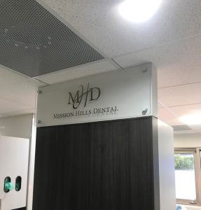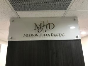
 When a client has an interior designer that has already designed their signs for them, it can make the entire process much simpler because there is less back and forth about the specifications of the sign. This was the case with Mission Hills Dental, who was renovating their office interior and was referred to us by one of our existing clients. One of the types of signs we made for them was an acrylic backer sign. Clear acrylic backer panel signs are very popular for offices because they are customizable and have a very professional look. Their interior designer had called out 3/8″ thick clear acrylic with a digitally printed logo. If you want the information on the panel to be 3-dimensional, we can make route letters or a logo from acrylic or aluminum. However, having raised letters was not important for this sign which is why the designer specifically called out a print.
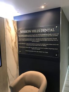
The reason a print was called out as opposed to just plain vinyl is that the logo had very specific colors that needed to be used. There is also a gradient in the logo which needed to be printed if we wanted to get the details exact. We made two of these logo signs that were to be installed in the hallway. A third acrylic backer sign we made was the Mission Statement sign. This was going to be installed in the reception room. The interior wall was going to be painted a dark blue and as the backer panel was clear, the client wanted to use white vinyl lettering to make sure that the words would contrast against the wall and would be easy to read.

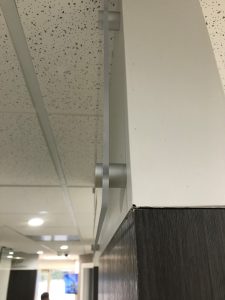
 All three of these signs were installed with standoffs. While clear acrylic looks very nice, you need to be careful about how you mount it because you will be able to see anything behind it. Standoffs are used to mount panels by the corners and edges so it is perfect for clear acrylic panels.
