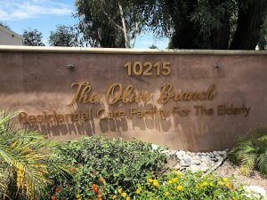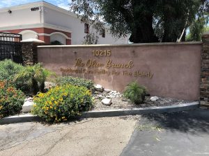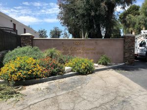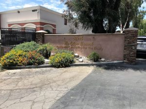
 The Olive Branch is an assisted living facility in Northridge that reached out to us for a new exterior sign. They have an existing wall at the entrance of their parking lot that they felt would be the perfect spot for a new sign. As you can see from the photos, the sign shows the address number, the name of the business, and a description of the business. They didn’t have a specific font that they wanted to use, they just asked us to choose a script font for “THE OLIVE BRANCH” and a non-script font for “Residential Care Facility for the Elderly”. Having a small script font with a lot of words isn’t a good idea for this type of sign because it won’t be easy to read. People will be driving by this sign as they’re driving so you want to make sure that it is easy to read as you’re driving by.

 The client knew they wanted the sign to have gold dimensional letters so we gave them two different material options. The first option was to use real metal with a gold finish. To obtain this, our plan was to flat-cut the letters from 3/8″ thick aluminum and anodize the letters gold. This is a very high-end option but perfect if you want to use real metal. The second option was to use a gold-colored acrylic. For this option, we would flat-cut the letters from 3/8″ thick gold-colored acrylic. The letters would have a gold color but would not have a metallic sheen. The sides would also not be gold as the acrylic has gold faces, but the core of the material is a smokey gray color.
After comparing pricing, they decided to go with the budget-friendly acrylic option. As you can see from the photos, the acrylic is spaced off of the wall slightly to add more dimension. The shade of gold looks great with the existing wall color and is sure to help people find the location.
