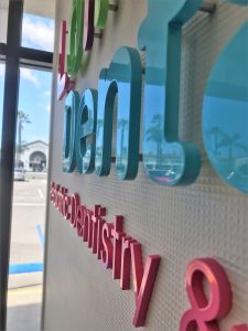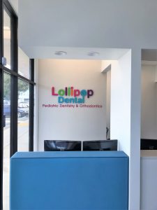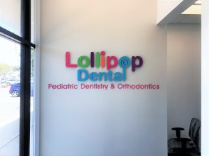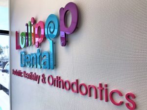
 Lollipop Pediatric Dentistry is an existing customer of ours who reached out to us for a new lobby sign as they were opening a new location. As you can see from the photos, their logo implements many different colors so the different letters were custom painted to match their logo colors as close as possible. Many logo designers will use CMYK colors in a logo file which is perfect for print but does not translate to paint. Because of this, we need the customer to provide us with paint colors or Pantone colors that they want us to use.
The letters and the lollipop logo were routed from acrylic and then painted their specific colors. For the larger “Lollipop Dental” letters, we used 3/8″ thick acrylic because we wanted to space the letters off of the wall. The stroke of the letters for “Pediatric Dentistry & Orthodontics” was too thin to stud mount so we just made them from 1/4″ thick acrylic and mounted them with VHB.

 Although we had made lobby signs in the past for them, each one has been a little different. The first sign we made for their Placentia office was not on a flat wall so the tagline was put on a backer panel instead of being installed directly onto the wall. The tagline also read “Pediatric Dentistry” not “Pediatric Dentistry & Orthodontics” so the overall sign width was a little shorter. The second sign was installed at their Garden Grove location and it was installed on drywall so the smaller letters were just installed directly on the wall like the larger ones. This new sign in Costa Mesa was pretty similar to the Garden Grove one, but we added “& Orthodontics” to the tagline and the larger letters were spaced off of the wall.
