The importance of an excellent brand presentation cannot be overstated. Case in point is Binswanger Glass at 1724 FM 1960 in Houston, TX. This company supplies residential and commercial customers with a broad range of glassware products including automotive windows and similar items. When the business’ management team invited our signage experts to visit its location to discuss building sign updates and cabinet sign refacing in Houston, TX, it became apparent quickly that we needed to undertake a concerted action to re-establish the setting’s strong brand presence.
A Pylon Sign is the Primary Wayfinding Tool
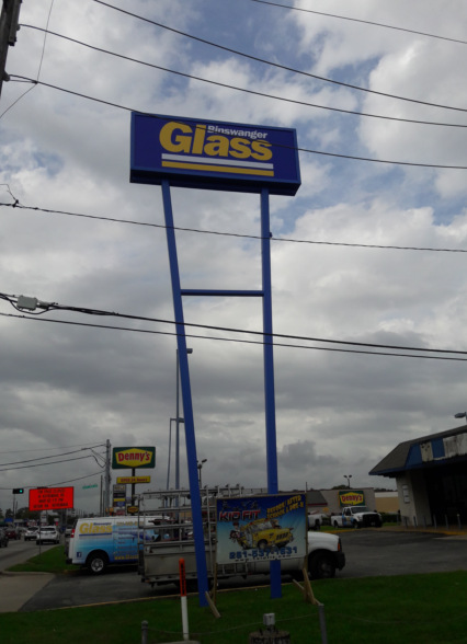
For the business owner fortunate enough to have a tall pylon located on the premises, this product is worth its weight in gold. It stands out from the landscape and allows for an introduction of a business’ corporate color palette and brand message. We started the refacing project for Binswanger Glass with this sign, which allows the company to harness its power. Our technicians repainted the structure while our graphic artists prepared the flex faces for the top.
Building Signage Creates a Company’s Brand Persona
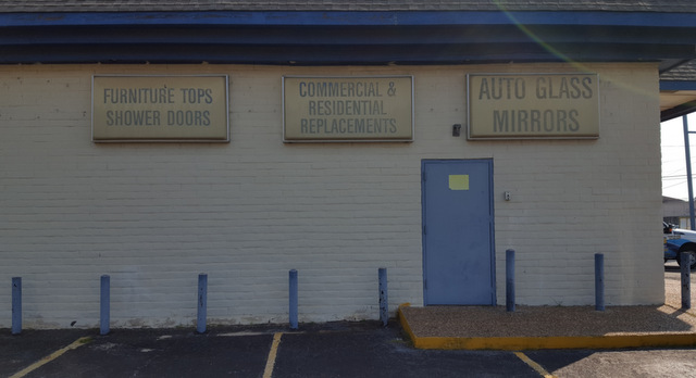
The old cabinet building signs
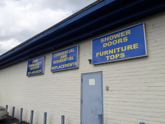
A new look means these signs are visible both day and night!
Prior to our arrival, the business worked with three smaller lightbox cabinets on the façade. The middle one featured the company’s information. Another set of unlit signs outlined a variety of services and products that customers could order there. While we were in the process of uninstalling the main building sign, we noticed that the cabinet showed signs of such severe erosion that it would be more expensive to fix it than to replace the product.
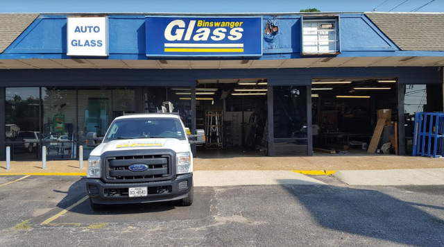
A look at the old storefront before restoration
Moreover, the fascia boards underneath the sign had rotted and presented a structural hazard. We consulted with the client and worked on a solution for the situation. The building’s fascia was fixed, and the client decided to have us replace the box cabinets in the front with a much larger setup of dimensional letters that we fashioned from 3/8-inch routed acrylic. Doing so allows for the display of the company’s popular font and color combination, which significantly heightens the brand expression. For the smaller unlit building signs, we used dibond to replace the four sign faces with updated products.
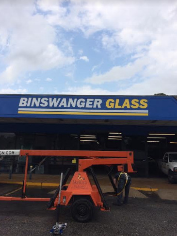
A restored building sign!
After its building sign updates and cabinet sign refacing in Houston, TX, the business’ location is much more visible from the street and presents with a far more inviting ambiance. The brand message once again shines brightly and helps to define our client’s location.
Monarch Sign & Graphics…Transforming images since 2014!!!

