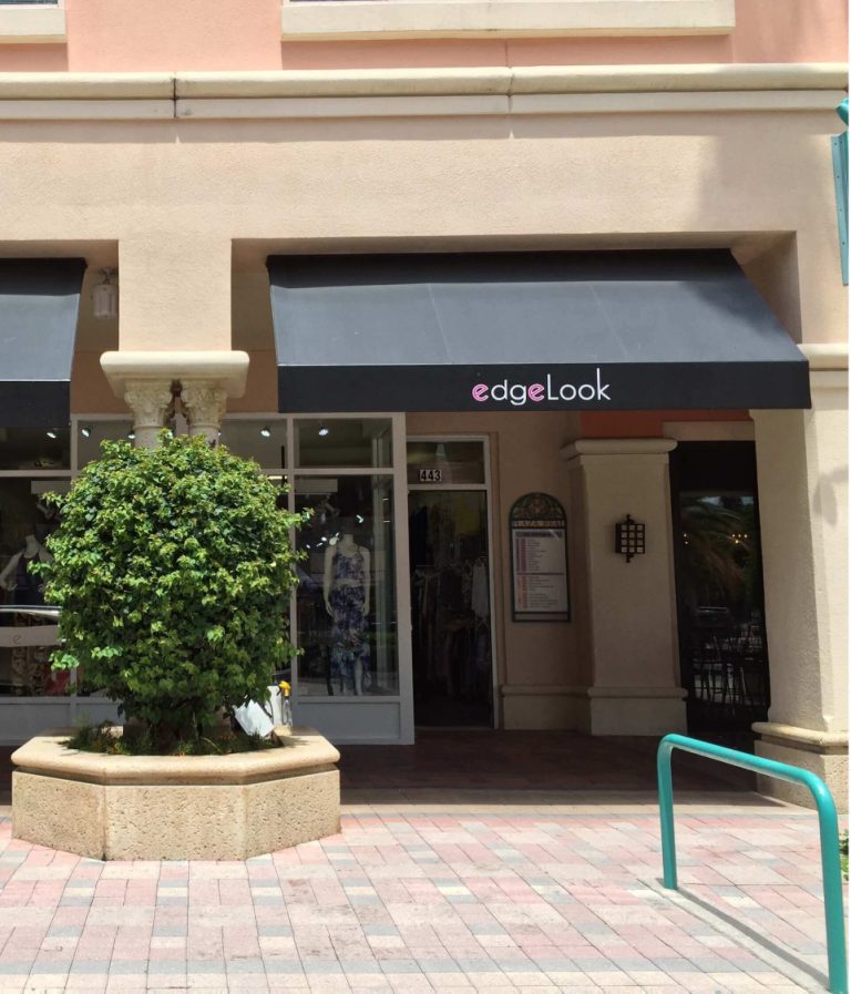
If you want to get more out of your sign marketing budget, strive for perfect placement.
“There are three contextual issues that seem particularly germane to the processing of information from signage,” write James Kellaris and Karen Machleit in a 2016 report by the Interdisciplinary Journal of Signage and Wayfinding. “All three relate to placement.”
Today’s post reviews each of these 3 keys to perfect sign placement highlighted in the research. Read on to learn how to position your signs to increase conversions and generate more impressions, or call 888-765-7446 to get additional help from a local Signworld partner straight away.
1. Optimize Sign Viewing Distance
The distance of the sign from viewers will influence visibility, attention, recognition, legibility, and attendant processing of your sign information. When smaller signs are placed too far away, “effortful processing” may not take place, as the viewer tunes out messages they perceive as being too hard to read.
If you’ve already got your finished sign in-hand, calculating the optimal viewing distance is easy. Generally speaking, you get about 10 feet of visibility per inch of letter height. Thus, if your lettering is 5 inches tall, you can mount your sign up to 50 feet away from the intended viewing area.
If you’ve yet to finalize the design, you can use this same formula to tailor font size to your intended viewing distance. Simply divide the intended viewing distance by ten to calculate the minimum font size in inches. Thus, if you planned to mount your sign 150 feet away, you’d need 15” letters.
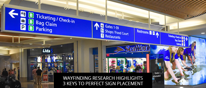
2. Optimize Your Sign’s Angle Of View
“Research indicates that the same message or object viewed from different angles will be processed differently,” write Kellaris and Machleit (2016).
For instance, research on upward-looking camera angles suggests that products and marketing messages displayed in this way are perceived as “strong or potent.” Thus, looking up at a sign may translate to viewers “looking up to the sign.” That same study revealed that high, downward-looking angles depict products and sign messages as “relatively weak and inferior.”
This isn’t to say that ground-mounted signs should be avoided, but rather that businesses should take advantage of this natural visual hierarchy to organize their messages in terms of importance. Thus, you might want your marquee storefront sign to be hanging up high, where audiences can look up to your brand name, while secondary signage stays on ground level.
3. Optimize The Sign’s Place In The Surrounding Environment
“There is a vast literature that suggests an object will be perceived, remembered, and evaluated differently depending on its immediate surroundings, as well as its relationship to its immediate surroundings,” write Kellaris and Machleit (2016). This former is known as “context effect,” the latter as “stimulus congruity.”
Generally speaking, signs that stand out from their surroundings are easiest to spot, but the incongruity makes signs more effortful to process. For best results, try to design signs that complement your surroundings for low-effort processing, without blending in to the point they’re overlooked.
Get Professional Help With Sign Placement—contact The Signworld Business Alliance
To get referred to a local professional who can help with site surveys, installation, and sign placement, call 888-765-7446 or visit the Signworld website.