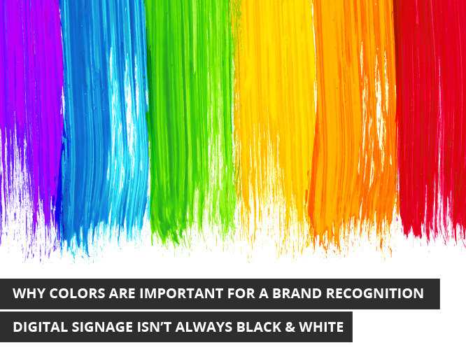
It can take much time and effort to build an idea into a company and then into a brand name with its own identity. The medium of digital signage can play an important role in the process of building up a business in the local community. Digital signage is ultimately about creating a pretext in the minds of your customers that whenever they see your sign, they will think of your business. This principle is precisely why the use of colors are of extreme importance when building a brand.
Think of McDonald’s for instance. They’ve successfully branded themselves under the colors of red and yellow. Think of any sports team across North America and they have their designated colors under which they operate. Referencing a brand in color is a technique used in every field as it only serves to strengthen the relationship between brand and customer.
They work!
Multiple studies have concluded that through the effective use of color, one can increase their brand recognition by 80%. Approximately 93% of consumers will examine a product or company’s visual appeal before deciding whether to purchase. The appearance of a brand is just as important as what it contains. This is key to attracting an audience and being able to relay to them an accurate message of what your brand is about.
Identify a color palette that is right for your business
It’s important to know the colors that are appropriate for your business and what colors won’t work together. No one wants to build a business tied between purple and green. These colours don’t mix. For your digital signage, pick a set of colours that you can depend on to accurately communicate your brand to clientele. Establish a colour to be put on background and a contrasting colour to be used for font. Often times, a third colour will be chosen in order to keep the visual interesting while further complementing the elements already at play.
Colours act as emotional triggers for many people
The reason why Starbucks has chosen green, white, and black is to strategically set them up in the minds of the consumer as a brand name that is environmentally sustainable, fresh, and wise. Different colors represent different things. For example, let’s examine red. When we see red, we think of danger, love, and passion. This makes red a go-to color for a stop sign, Valentine’s Day, and as a complimentary color for fitness-based materials. When selecting your colors for digital signage, know why you’re selecting your colors and what they mean.
Mix them up and keep it interesting
Variety is always nice but be ensure not to change more than needed. When selecting the colors for your digital signage, these should be the same colors that you use to brand all of your business materials with. These are the colors that will be with you for the entirety of your business’ existence. It’s important to keep a sign from becoming mundane and boring. Examine the effectiveness of your digital signage every six months or so. Make the changes necessary in order to keep your clientele engaged.
Digital signage begs for color. To stick with a simple black and white design isn’t going to make your digital signage stand out and one will find their sign not being seen because of it. Colors attract attention and will make your sign pop. Colors are important for brand recognition because not everyone is going to retain the name of your business on their first exposure to it – but they’ll remember the colors.
Color helps your brand form an instant connection with the audience. No one is going to get excited over a black and white digital signage. Optimize the effectiveness through the inclusion of color and know that you won’t regret it. With color, one gets improved comprehension, learning, and readability, and will see more customers than ever before picking up on their digital signage. When choosing the colors that are right for your digital signage, be sure to refer back to the tips offered here in this blog.


