Ready to design a new sign for your business or private event?
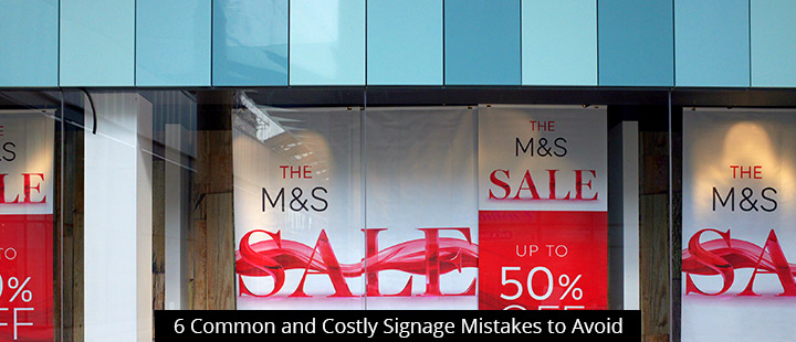
Be sure to steer clear of these 6 common and costly design mistakes:
Contrast. Back in primary school, we learned that there are complementary colors and contrasting colors. Applying this simple elementary concept to your sign design can help your sign produce much higher audience engagement and conversion rates.
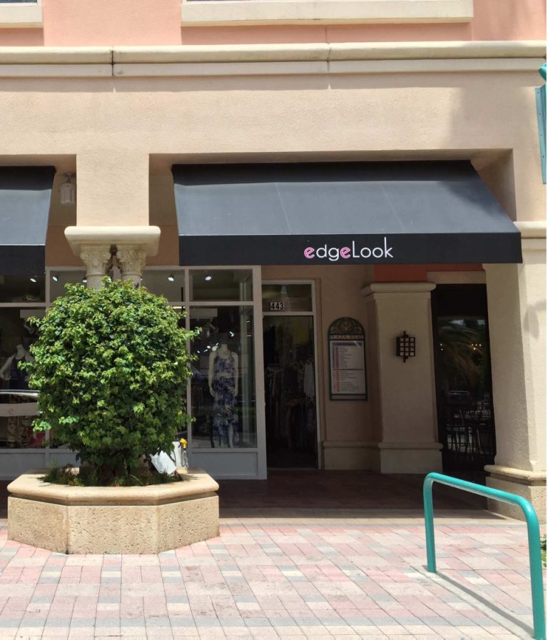
When designing your sign, you want your font to contrast sharply with the surface on which it is displayed. But contrast doesn’t always mean clash–it’s easy enough to choose a letter color or finish that stands out against the background color without looking gaudy or garish. If you need help choosing the right contrast, contact a Signworld representative near you.
Spacing. One of the worst mistakes you can make during the design phase is not measuring. When you run out of room and start squishing letters together to make space, your sign looks cluttered and confusing at best. In many cases, it will be illegible, especially to those passing your business in a car. Many sign design software programs auto-adjust your spacing or flag crowding issues. If you’re putting up your own letters, make sure you use a paper template to help with spacing and alignment.
Font. Make sure you choose a legible font–the classics exist for a reason! Avoid fancy fonts that may be difficult to read at a glance–and don’t even think about Papyrus or Comic Sans–even if your business focuses on elegant events and whimsical products. In this case, legibility trumps “branding.” And besides, there are plenty of ways to make your sign look “fancy” enough to be on-brand without an overwrought font.
Art. Big, intricate logos are generally “fails”–they either get overlooked or completely distract from the message you’re trying to convey. As a general rule of thumb, try to make your logo so simple that you could recognize the brand even if you squint your eyes enough to make your vision blurry. Remember: the vast majority of your customers will be taking your sign in at a glance.
Materials. Some people assume that the most expensive sign materials will make the best sign. After all, you get what you pay for, right?
That’s not always the case. For instance, some materials may be expensive because they’re made to withstand harsh outdoor conditions. If you plan to mount your sign indoors, you have nothing to gain by paying extra.
Other owners may feel that they need a certain type of material to create the look they’re after. For example, they may feel that expensive wooden lettering is the only way to create that rustic look, when in reality plastic lettering can be treated to look exactly the same for a fraction of the price.
Don’t overspend on materials that won’t benefit you. Contact a Signworld employee to help you find the best option for your needs and budget.
Size. This is another critical component for your sign’s legibility. The general rule of thumb for letter height is that they should be 4” tall for every 100 feet of viewing distance. Thus, a sign viewed at 100ft need 4” letters, while a billboard viewed from a highway 1000 feet away will need at least 40” lettering.
Get more sign design tips from Signworld
Visit https://signworld.org or call 888-765-7446 to find a Signworld business partner in your area.