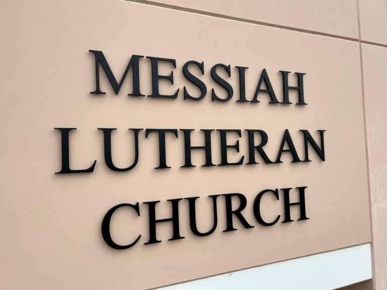
We have a great working relationship with Messiah Lutheran Church in Yorba Linda. Previously, we produced directional signs to assist members and first-time visitors with wayfinding. When the client contacted us this time, the church needed brushed aluminum building lettering in Orange County, CA.
Tall Letters Welcome Visitors

We discussed the project with the client. They informed us that they were looking for tall building letters that would stand out and be easy to see from a long distance away. Moreover, the client specified the installation location as the tallest part of the building. Our graphic artist designed a product that met all these requirements and perfectly fit in with the existing signs.
In the shop, we used three-quarter-inch-thick cast aluminum for the letters. They are 14 inches tall and suitable for stud mounting. Adding some spacers cast a minute shadow that underscores the message on the facade. We painted the fronts with a black anodized finish. The finished product is elegant, looks ideally suited for the space, and meets all the client’s requirements.
How to Choose a Material for Building Letters
Metal is a popular choice because it is durable and versatile. The finishes typically depend on metal. Examples include Cor-Ten or stainless steel, aluminum, or copper. This material is generally heavier, so the facade should be in good shape before the installation.
If you prefer something a little lighter, we recommend acrylic. This material is also a good selection when you like colorful building signage. For a more 3D presentation, there are formed plastic letters. They are also lightweight, and they support prismatic facings. Depending on your brand message, these are excellent ideas.
Our clients also like outdoor-rated foam. This material comes in varying densities, which can save you money. Choose a thickness in keeping with your anticipated time at the location. As a result, you do not overpay on building lettering.
How Thick Should Building Lettering Be?
The client selected a thickness of three-quarters of an inch. However, you might go thinner with one-eighth of an inch. Other clients like to go with a full inch. It is interesting to note that we can heighten the three-dimensional appearance of the signs with contrasting paint and spacer installations for the shadow play.
If you like the great look of metal but are not sure that you want to pay for an inch of the material, we recommend using an inexpensive outdoor-rated foam that we can then treat with thin metallic veneers. A clever painting approach heightens the illusion that the letters are made through and through of metal.
How to Order Your Next Building Sign
Do you need brushed aluminum building lettering in Orange County, CA? Do you think that highly-polished acrylic might be a better option? Discuss your next building sign purchase with our graphic artist to learn more about your options, set up a design appointment, and get the ball rolling on the project. Call us today!

