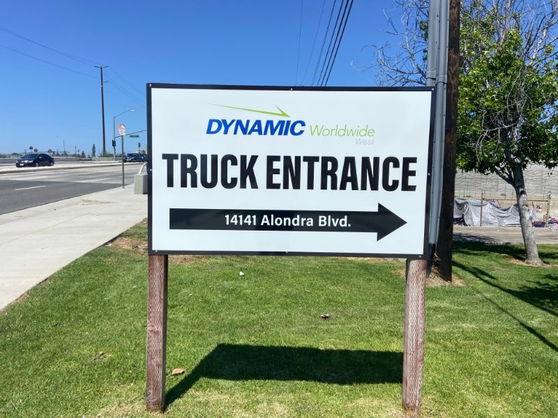
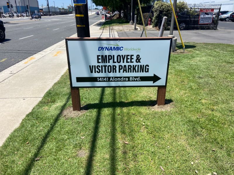
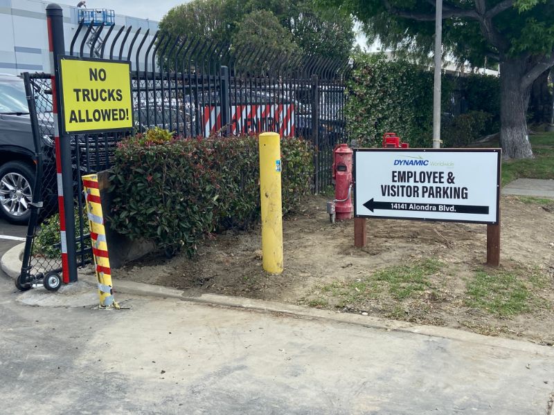
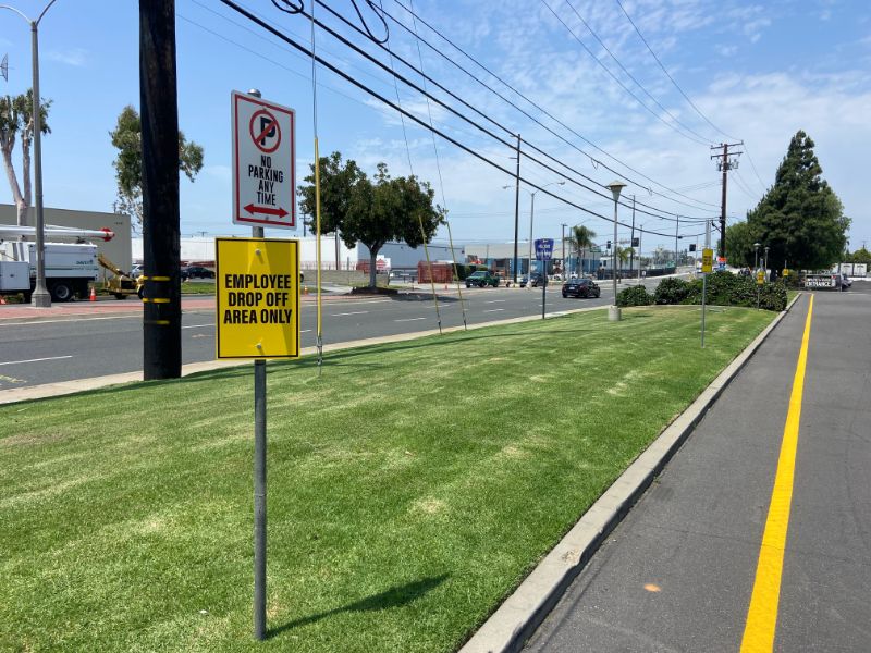
Over the years, we have done a lot of work with Dynamic Worldwide. Examples include receiving signs, parking lot signs, dock bay numbers, and a building sign. Some of the most important products we designed, produced, and installed were the markers guiding traffic flow at their locations. Recently, the company invited us to come back and assist with more signs and graphics for warehouse and distribution companies in Los Angeles CA.
Changes to the Traffic Flow Call for New Signage Displays
Because the management team adjusts traffic flow as needed to serve customers and employees alike, they recently made some changes. For example, the company now directs trucks to exit where the employees used to enter. Next, the business moved the employee entrance to the other side of the building. The result is a traffic flow pattern that works better for everyone.
 To ensure the safety of workers, visitors, and delivery drivers, the management team asked us to put together new signs. In response, we placed two post and panel signs, a pole-mounted sign, a gate-mounted product, and another sign that we installed on the building. Next, we took two of the existing post and panel signs back to the shop for refacing. It is an excellent idea when the base materials are in great condition, and you just want to change the message.
 We finished the product with the application of an anti-graffiti laminate. It is a must-have for the sign at the truck entrance. This particular product seems to be a favorite target of local taggers. Our team installed all the signs together to ensure a safe rerouting of the traffic pattern at the facility.
Top Three Elements of Excellent Wayfinding Signs
 Whether you run a warehouse, operate a big box home improvement store, or need to guide traffic through a school’s parking lot, we can put together signage that helps visitors to your location find their way around. In the process, we have identified three elements that boost the functionality of the products.
- Arrows. Nothing is quicker and easier to recognize and follow than an arrow. It is vital to underline any instruction to your visitors with this graphic. Even if the written information does not immediately trigger recognition, the arrow will.
- Addresses. Add numerals or street names to your signs. If your employee entrance is around a corner, say it on the sign. If you routinely accept deliveries at a specific address, feature it right on the sign.
- Details. While you do not want to overwhelm the visitor to your location with information, it is crucial to show what they are likely looking for. For example, if you have different entrances for employees and visitors, spell it out. Similarly, let truckers know where they should enter or exit.
Do You Need to Upgrade the Wayfinding Signage at Your Facility?
 Our shop routinely puts together signs and graphics for warehouse and distribution companies in Los Angeles and Orange County. If you already have some panels on-site, and they are in good condition, consider having them refaced rather than replaced. Contact us today to discuss the project!

