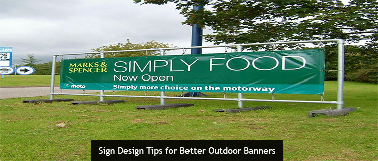
Today’s post shares 3 essential tips for better outdoor banner design, courtesy of the Signworld business alliance.
Be Mindful of Mounting Considerations
If you think all that’s required for a winning banner is a beautiful and engaging design, you’re wrong. But don’t feel bad–you’re not alone. In fact, this is one of the most common mistakes we see during the sign design process.
When designing your banner, you need to think beyond how it appears on-screen in Photoshop, InDesign, or whatever other software you use.
Overemphasizing the on-screen design usually leads to spectacular failures. For example, one of the most common mistakes we see is having the design cover the entire banner. While this may seem like an efficient use of space, it leads to situations where the grommet holes might cut through or cover parts of the design. If you are unsure about how much of a border to leave to avoid this, contact a member of the Signworld business alliance for help.
For best results, consider as many real-world factors as possible during the design phase. This also means thinking about weather and wind conditions, both when choosing your overall design and materials. If your banner will be mounted somewhere with a strong breeze, for instance, failing to use a mesh banner could mean your message is illegible as the banner flaps wildly in the wind. Heavy winds will be less of an issue for banners with simple visual branding (e.g. large-print logos), but can be disastrous for companies trying to include longer messages, promotional details, or contact info.
Size Matters
In the banner business, size definitely matters. Outdoor banners are meant to be big enough to command your the attention of those near and far. Choosing the wrong size for your banner or font is a classic mistake that we see in the design phase.
Again, this decision will rest largely on your unique mounting considerations. Where will your banner be hung, and what will be the average viewing distance?
As a rule of thumb, aim for 10 inches of letter height for every 100 feet of visibility. That means a banner that’s meant to be read on the highway 300-feet away will need a font that’s at least 30 inches tall.
Aim for a Bite-Sized Message
Even the biggest banners should keep their message, design, and copy relatively short and sweet. The average reader is only going to give your banner a glance–about 2 seconds on average. If that’s not long enough to absorb your banner, start trimming. Nobody is going to hit the brakes on the highway or stop in the middle of a busy crowd to read your wordy message.
This is an easy mistake to make, since rich and complex banners always look great on-screen. But again, best results come from thinking about your banner in the real world.
When it doubt, K.I.S.S. (keep it simple, stupid!). Save the promotional details for on-site signs that customers can take their time to read after they’ve entered your place of business.
Learn More About Banner Design from the Signworld Business Alliance
If you’d like to learn more about what Signworld business partners can help you create, visit https://signworld.org to find a representative near you.