Reliance Real Estate is a returning client. Over the years, Superior Signs and Graphics has tackled a broad range of projects for this business at different locations. When the firm needed a sign and graphics makeover in Yorba Linda, the management team contacted our sign shop for assistance once more.
A Cohesive Signage Suite Welcomes Customers and Sets the Tone for Interactions
 There are currently two companies doing business at this location. One is Trilogy Escrow, which assists customers with real estate loans and closings. The other business is Reliance Real Estate, which helps customers find the homes that are precisely right for them.
The goal of the signage suite is to provide a cohesive presentation of both brands at the same location. At the same time, the signs have to set the tone for the consumer’s expectations of what it is like to do business with the companies.
 For this particular office, we designed, fabricated, and installed a set of complementing products.
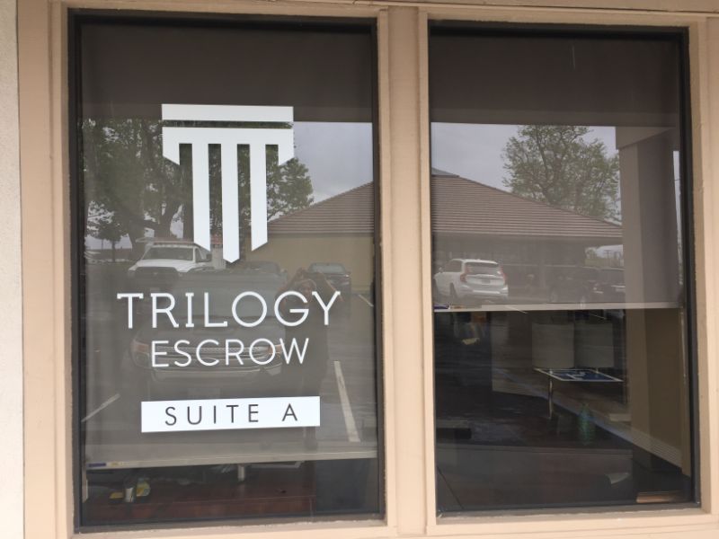
- Window graphics. For Trilogy, we put together attractive window graphics that advertise the presence of escrow services at the site. They feature the firm’s name and logo.
- Door graphics. Our team fabricated colorful logo elements that mimic those of the firm’s corporate persona. Customers recognize it from the business’ website and written communication as well as sales collateral. For the lettering, technicians used white vinyl that contrasts well with the gray tones of the door.
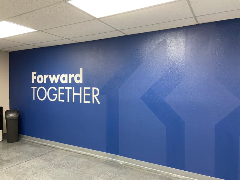
- Vinyl wall lettering. The firm requested the creation of a “Forward Together” wall display. Because it would display on a medium blue wall with subliminal logo designs, it was vital to combine color play with contrast ability. In this setting, we opted for white vinyl that we featured in two different fonts for a visually appealing setup.
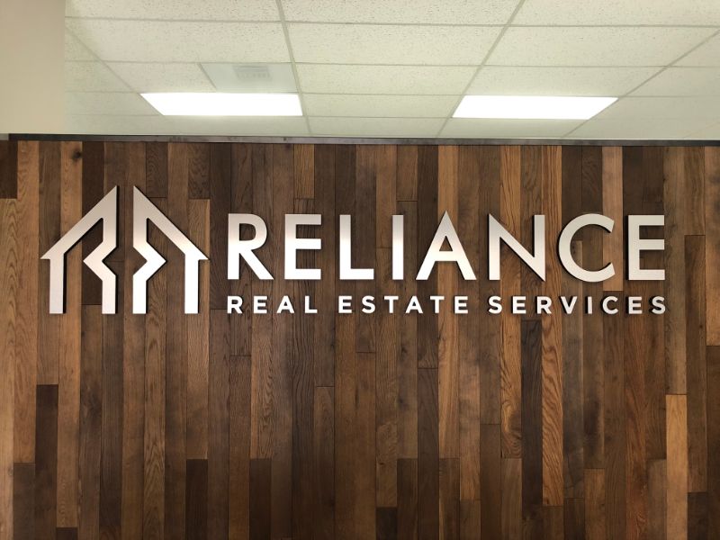
- Dimensional lettering. One of the most critical features of the office is the “Great Wall of Sales.” Recognizing expert professionals, the client requested the use of dimensional letters that would catch the eye of visitors to the venue. We complied by using one-inch-thick Gatorfoam that we treated with brushed metal faces. Two wall placards with reverse-cut lettering made from half-inch-thick black PVC and brushed metal faces complete the design.
By the way, we saved the client time and money by fabricating and painting all style elements in-house.
Does Your Business Need Signs and Graphics in Yorba Linda, CA?
 Maybe you are redoing the signage in your office. Many business clients choose to do so when they undergo a rebranding. Moreover, companies occasionally refocus their logo designs and color selections to remain in step with changing consumer tastes.
Another reason why your business might need a sign and graphics makeover is the addition of another company that sets up shop in your office or storefront. Superior Signs and Graphics professionals frequently work with companies that want to display two firms’ symbols and lettering, which still focus on the different display elements. At the same time, they have to harmonize in the space. We can help.
Contact us today for a free sign quote!

